Justin Windle is a very talented creative developer and I’ve been following his work for years, check his website if you’re not convinced.
he started an enterprise called stuvio ; the goal is to allow generative artists to exhibit and sell prints of their works. he gathered a selection of creative coders / generative artists and I was part of the list (an honor).
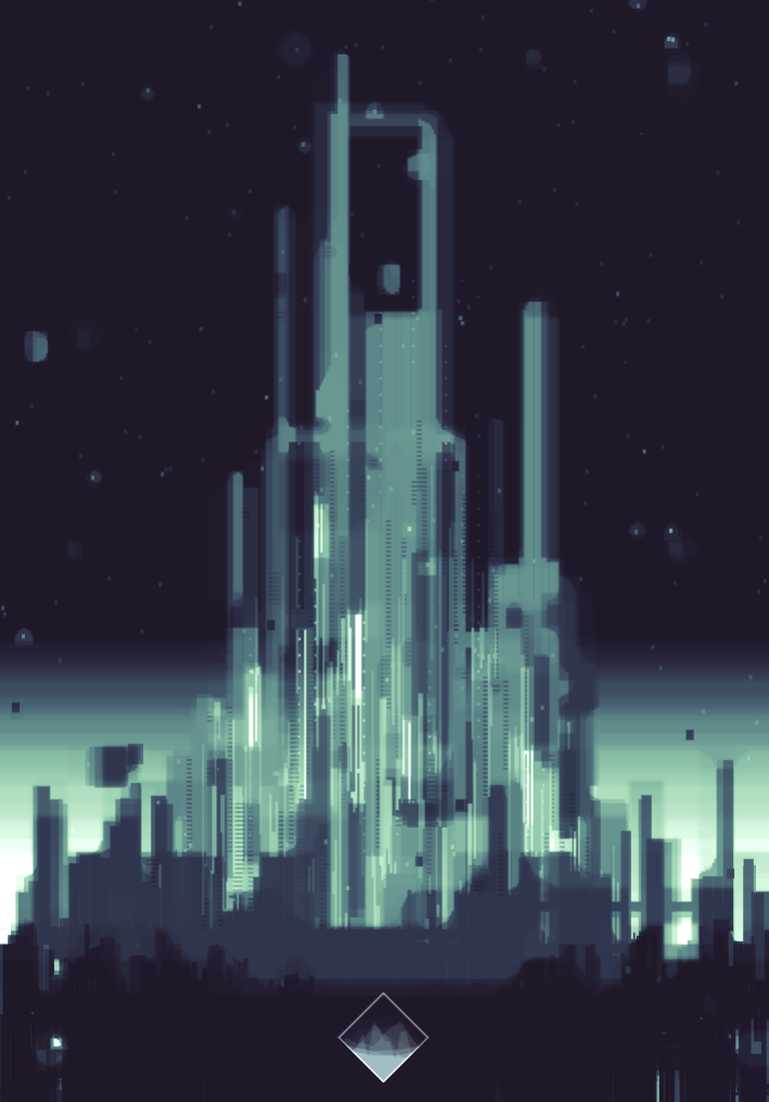
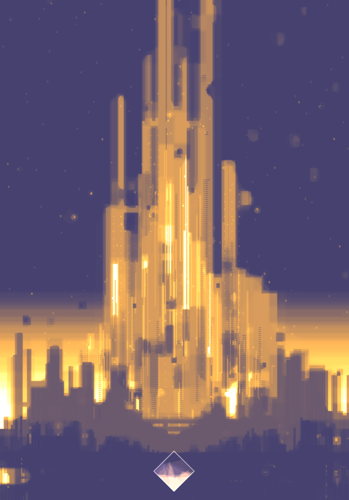
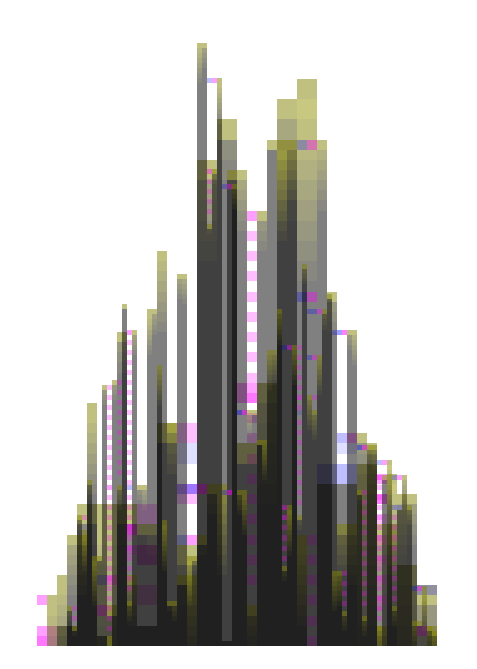
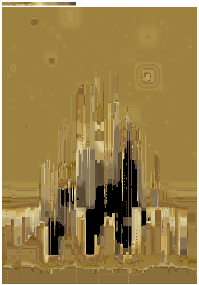
the Stuvio website might take some time to be released yet I started working on a couple of pieces. one of which is called “citadels”, when I got good enough results, I posted some screenshots on twitter and got very enthusiastic feedbacks (thanks to all!).
some people were curious as to how it was done and tweets only allow for replies like this:
canvas + PRNG distribution + a series of Scale2x/3X + some down/upscaled redraws w != blendmodes (>glows) + a gradient map.
which is a bit dry :)
so I’ll try to get more into details in this post.
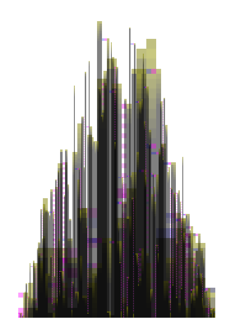
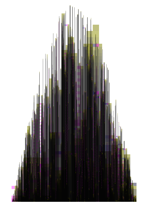
here are two more variations:

a word about the “creative process”, I don’t really know when or why or how I got this idea. the sure thing is that I watched -approximately- every science fiction movie released after 1902 and after all, who wouldn’t want to create generative a retro futuristic city skyline?
graphically it’s easier to isolate at least 2 major inspirations:
Nicolas De Staël and his abstract minimal compositions, I liked the clumsiness of the paint patches, the limited set of colors.
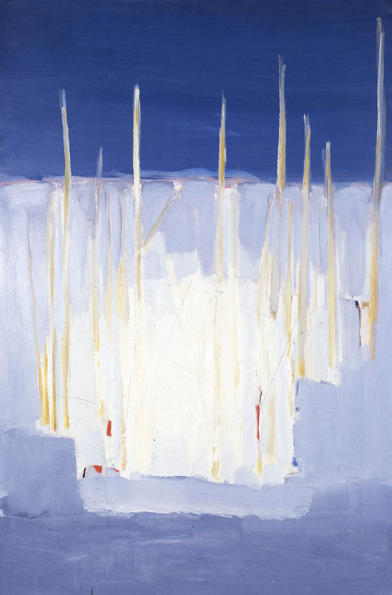
source
and Olly Moss’ mesmerizing Star Wars trilogy posters
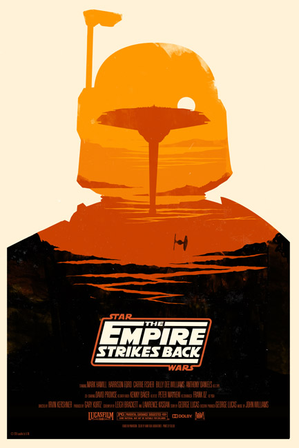
I liked the mix of vector shapes, something that looked like handmade textures & the flat colors.
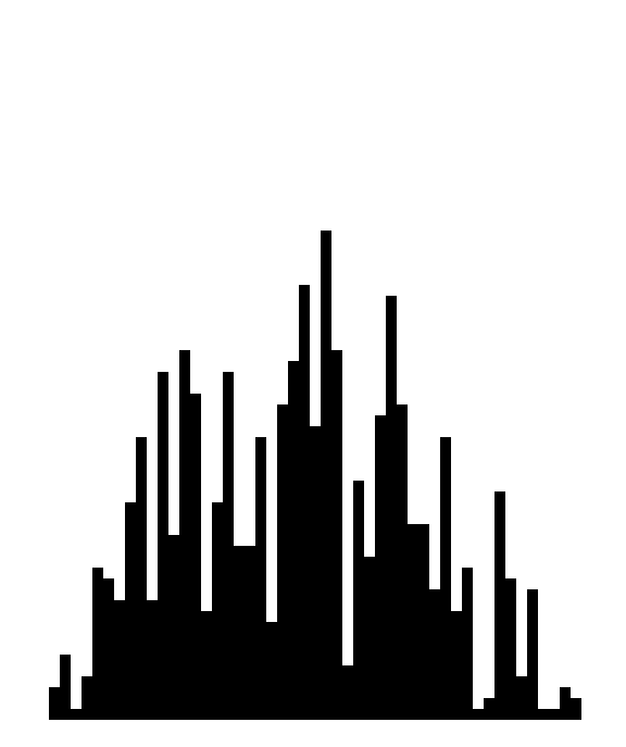
the city is essentially a series of rectangles with a fixed width and variable height. I used a cosine function to soften the heights on both sides. if you’re interested in distribution functions I’d recommend Petri Leskinen’s blog, he provides great explanations about distribution.
I obtained something like this:
then I drew some “bridges” : at random heights, if a “pixel” is empty, I check if the pixels on both sides are filled, if so, we have e bridge. this gives us the red dots:
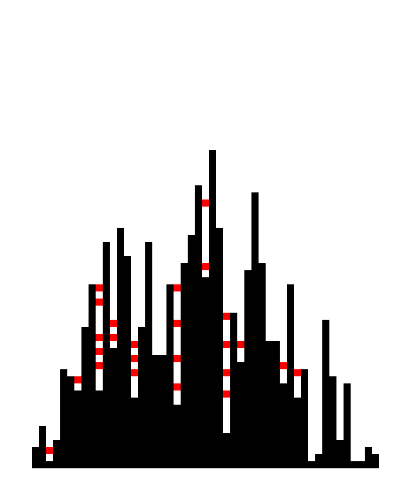
building on the previous, there are longer bridges: if a pixel is empty and has a filled pixel on its left, loop while it finds a filled pixel on its right. the pink lines below.

this was a good start, note that it uses a PRNG: Pseudo Random Number Generator instead of Math.random() ; this allows us to reproduce seemingly random series and it is very helpful to test differents settings or algorithms. if you’re interested I use a Mersenne Twister, it works fine :)
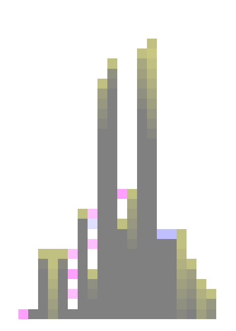
I said I used a fixed width and variable heights, this was for a good reason called layers.
I use differents ranges of widths and composite them using opacity and blend modes. here’s a series of layers building up the skyline.
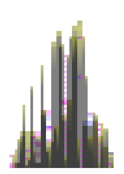
you see that after the third iteration, we get a complex object with lots of details at various scales and a feeling of depth. now if you go too far, it will also stop working, for instance after the sixth iteration, it represents only the clusterfuck it became.
 good start, but I mentioned the clumsiness of De Staël, I wanted to make it less blocky so I unleashed the power of Scale2D, Scale3D and VOILA !
/!\ update /!\ here’s the GIST of JS version of the scaleX.
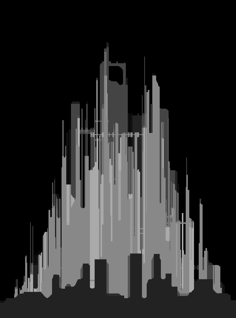
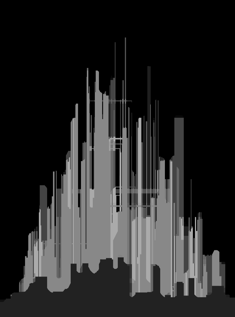
I won’t go into the details of the algorithm, it’s quite simple and extends on morphological operators. the important bit is that it gave a good looking result and created more accidents in the structure of the buildings. I added a foreground and blending between different layers (alternating lighter/darker)
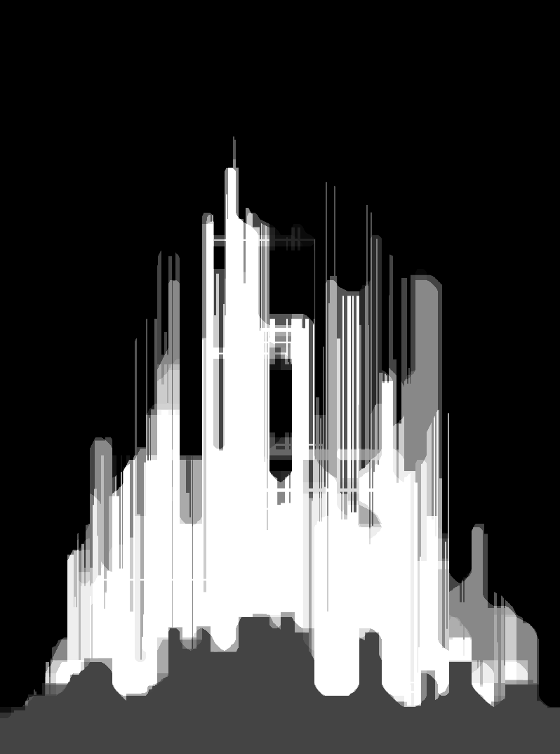
still a bit too flat so I added a gradient to reinforce the horizon and some particles in the air.
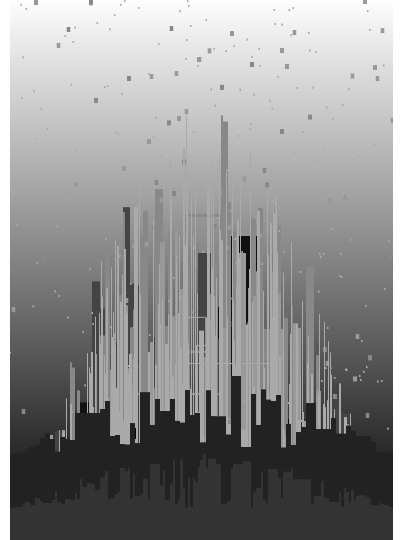
and this is the result, I was happy with what happened to the particles (it was an accident), also the “glowing” effect works well and this was intentional :)
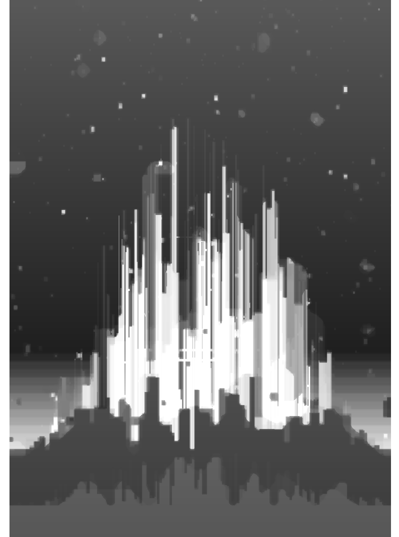
the last step was to colorize the citadel, I used one of the oldest tricks in the book: palette mapping. use the greyscale value of each pixel to sample a gradient of 0xFF values. this might give funny (and not necessarily ugly) results if the gradient’s colors are not sorted. for instance, the image below uses the first line of the smaller picture on top as a gradient.
as if Klimt and Hundertwasser had painted together ^^
in addition I ‘ve used some patterns to draw windows here and there, also added a representation of the citadel’s “DNA”, the seed used to initialize the PRNG (it’s the little diamond at the bottom of the final pictures).
and that was it!
enjoy.